theavenger001 wrote:
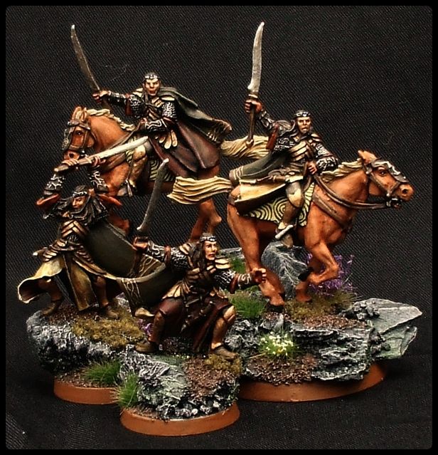
For once this is a mini of your that I don't like that much up close. The distant pictures are amazing, the freehand looks great. But just that one up close picture shows (to me) that the freehand is messier than I am used to from you. Some of it (like the white stripes on the blue bit of cloth) looks like it is not covering well enough. It looks a little bit streaky, almost like you used craft paint instead of real figure paint. I also personally don't like the eyes, but that's just a stylistic thing, I don't like having the white so prominent.
There are some good things about it though. From a table top it would look outstanding, and I really like what you've done with the basing. A lot less busy than you normally do, but it works well. Aragorn's skin and beard are also well done. I do like the tree freehand on the back end, it's more the star on the front end that looks messy to me.
Hope that's helpful and not just bashing/disheartening.

agreed in general, but it's often useful to have zoomed in images to see detail you've missed. A magnifying glass cant offer that as it cant focus on the whole model.
Bear in mind that you are viewing an inch and a half figure magnified quite heavily and viewed under conditions that hopefully the owner would never view. I hate magnified images of my work in the same manner that if you look at art in a gallery up close, often the eye will see the rough textures that the eye will, from a distance, 'blend' the colours and the tones together. This is why I post very little in the way of images super zoomed so to speak as I prefer a 'reading distance' approach to the viewing of figures. If it looks good six inches away, it is good!
 Top
Top Top
Top Top
Top Top
Top Top
Top Top
Top Top
Top Top
Top Top
Top Top
Top Top
Top Top
Top Top
Top Top
Top Top
Top Top
Top Top
Top Top
Top Top
Top Top
Top
